Paint is one of the cheapest, fastest ways to change how a space feels, and when you know how to make a room look bigger with paint, you can trick the eye into perceiving square footage that isn’t actually there. No knocking down walls, no expensive renovation — just the right color choices applied the right way.
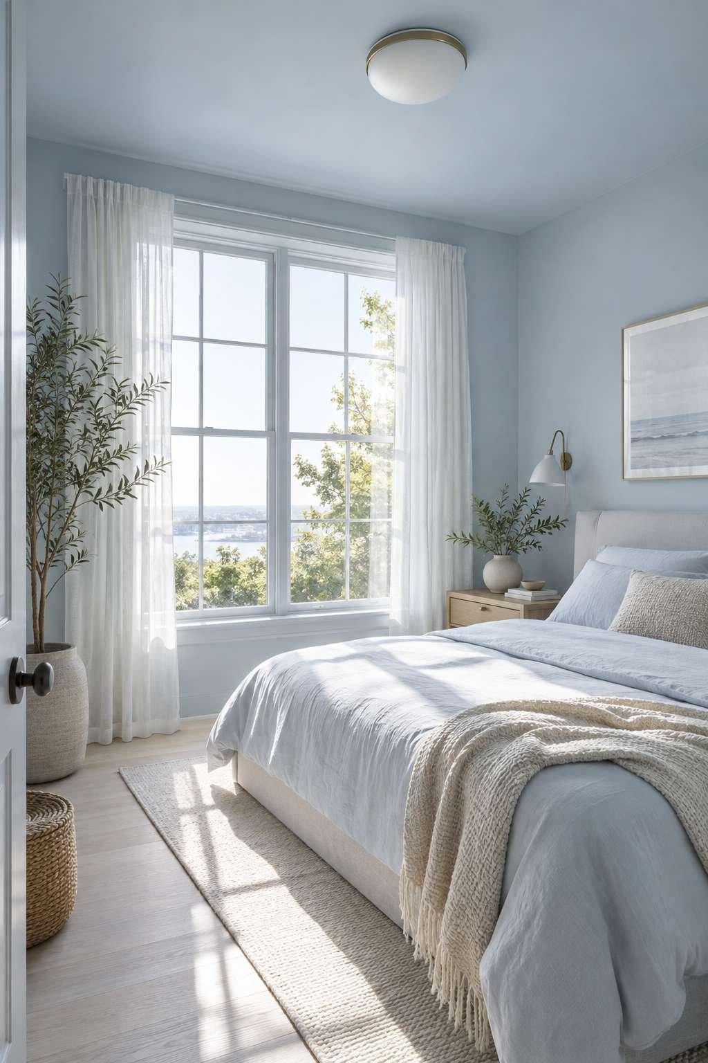
This guide walks through every technique that actually works, from color selection to sheen levels to where the eye naturally travels in a room. By the end, you’ll have a clear plan for tackling your smallest, most cramped space.
1. Start with Light, Cool Colors
Light colors reflect more light around a room, which is exactly why they read as more spacious than dark, saturated tones. Soft whites, pale blues, and gentle greens all bounce light rather than absorbing it.
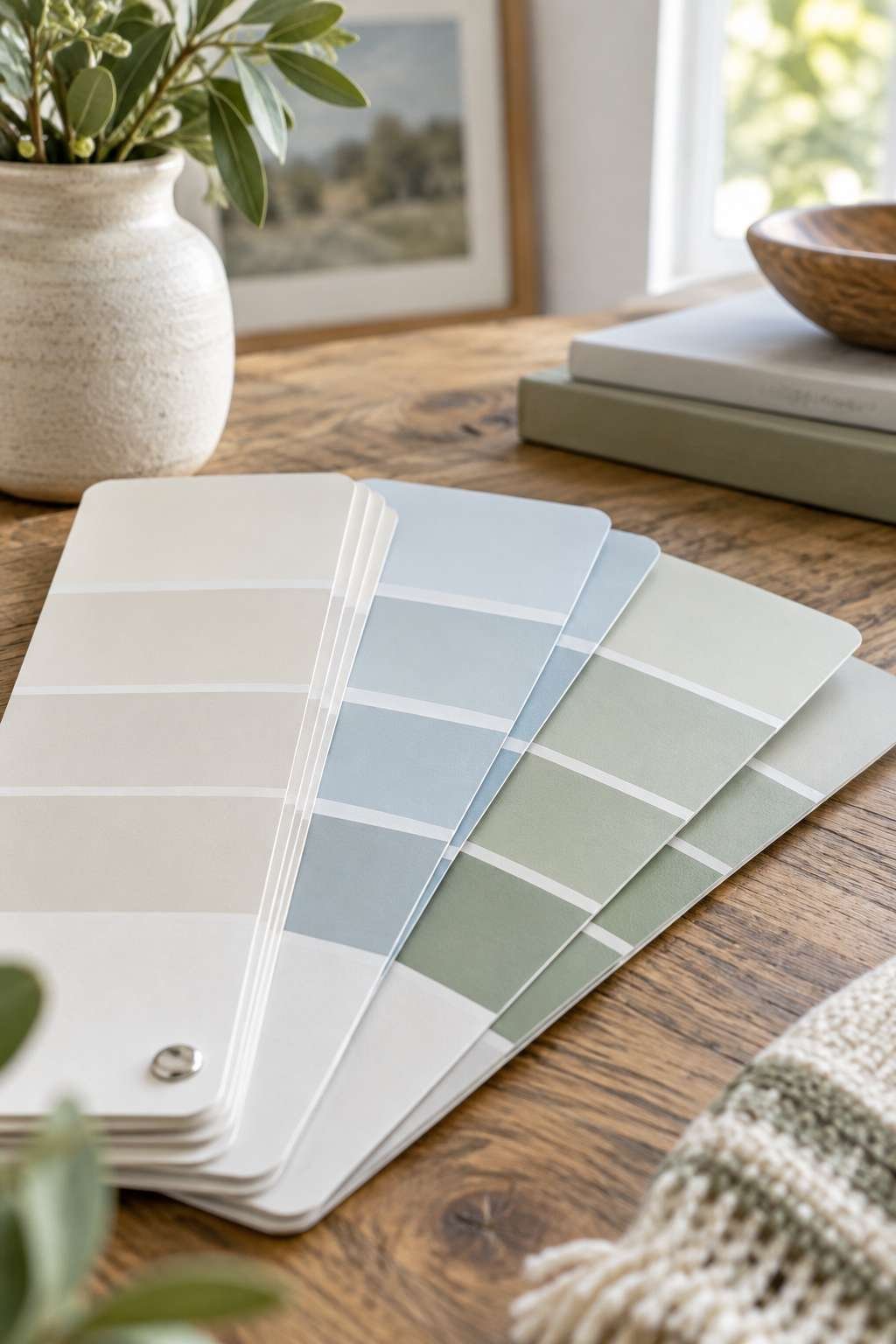
Cool tones in particular tend to recede visually, pushing walls slightly outward in perception even though nothing about the physical dimensions has changed. Warm, saturated colors do the opposite — they advance toward the eye and make a space feel like it’s closing in.
- Choose off-whites and soft neutrals as a safe default
- Lean toward cool undertones like pale blue-gray or soft sage
- Avoid deep, saturated colors on all four walls of a small room
- Test swatches at different times of day before committing
- Remember that lighting temperature changes how a color reads
2. Paint the Ceiling the Same Color as the Walls
One of the most underused tricks for a small room is carrying the wall color straight up onto the ceiling. This removes the visual break where wall meets ceiling, which is often what makes a low ceiling feel like it’s pressing down.
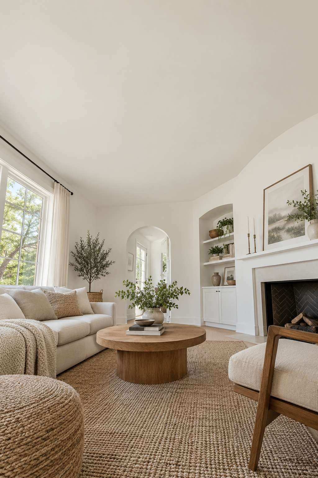
Without that hard line, the eye reads the whole room as one continuous volume instead of a boxed-in space with a visible lid.
- Use the same paint color and sheen on walls and ceiling
- This works especially well in rooms with lower-than-average ceilings
- A slightly lighter tint of the wall color also works if pure matching feels flat
- Skip this trick in rooms with already-tall ceilings, where contrast can look intentional instead
- Pair with white trim to keep architectural details from disappearing entirely
3. Use a Monochromatic Color Scheme
Sticking to a single color family throughout a room — walls, trim, even furniture where possible — removes the visual chopping-up effect that happens when too many colors compete for attention. Fewer breaks mean the eye reads the space as more unified and, in turn, larger.
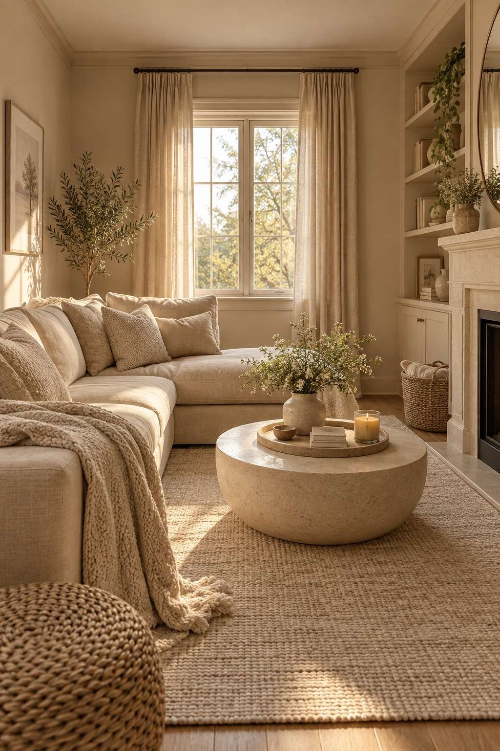
This doesn’t mean everything has to be identical. Varying the shade and tint of one base color adds depth without introducing the visual clutter that multiple unrelated colors bring.
- Choose one base hue and stay within its family for major surfaces
- Vary the shade slightly between walls, trim, and ceiling for subtle depth
- Add texture through fabric and materials rather than competing colors
- Save bold accent colors for small, deliberate details only
- Keep flooring in the same tonal family when possible
4. Pick the Right Sheen, Not Just the Right Color
Sheen level matters almost as much as color choice. A soft eggshell or satin finish reflects light gently and evenly, which supports the illusion of a larger space far better than a flat, light-absorbing matte finish.
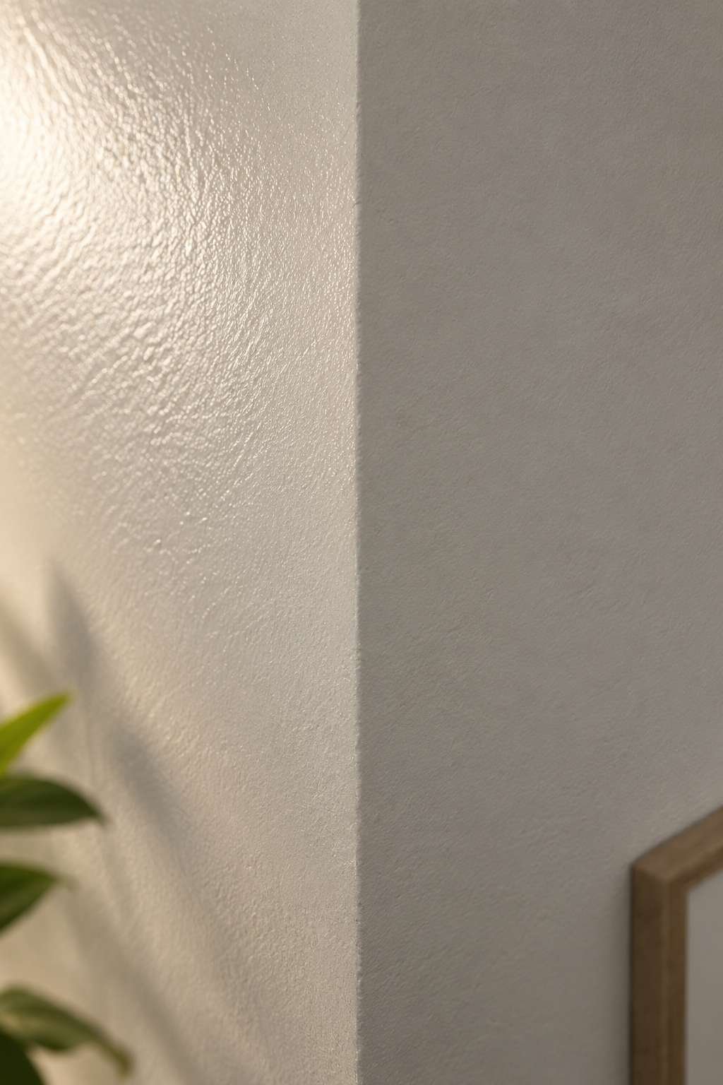
High-gloss finishes bounce more light but also highlight every wall imperfection, so eggshell or satin tends to be the sweet spot for most rooms trying to look more open.
- Choose eggshell or satin over flat matte for main walls
- Reserve semi-gloss for trim, doors, and moldings only
- Test sheen samples under your actual room lighting before buying
- Avoid full high-gloss on large wall surfaces with visible flaws
- Remember that sheen also affects how easy walls are to clean later
5. Create Vertical Lines to Draw the Eye Upward
Anything that pulls the eye upward makes a ceiling feel higher and, by extension, a room feel larger overall. Vertical stripes, floor-to-ceiling curtains painted to match the wall, or even a painted vertical accent near a doorway all achieve this.
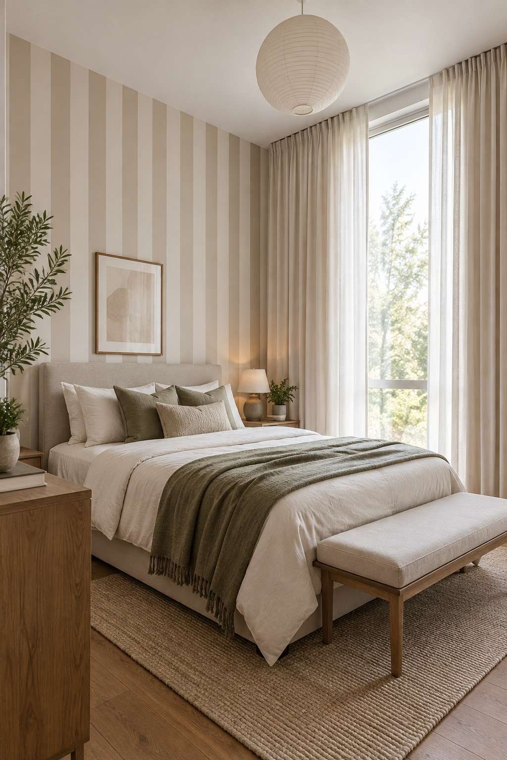
The goal is continuous vertical movement without a hard horizontal stopping point, which is why chair rails and horizontal color breaks tend to work against this particular technique.
- Use subtle vertical stripes in a low-contrast tone-on-tone palette
- Extend curtain rods close to the ceiling and paint the wall behind them the same color
- Avoid horizontal color blocking or a contrasting chair rail
- Keep any pattern subtle rather than bold and busy
- Pair vertical lines with tall, narrow furniture pieces for consistency
6. Use Paint to Blur Architectural Boundaries
Doors, trim, and built-ins painted in a contrasting color create visual stops that chop a room into smaller-feeling segments. Painting them the same color as the surrounding wall removes those stops entirely.
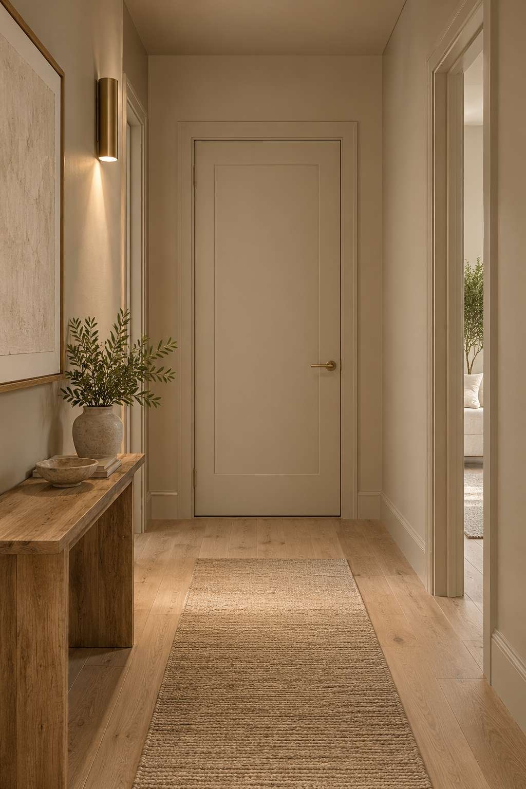
This technique pairs especially well with the ceiling trick from earlier — the more surfaces that blend into one continuous color field, the less the eye has to process, and the bigger the room reads.
- Paint doors and trim the same color as the adjacent wall
- Blend built-in shelving into the wall color rather than highlighting it
- Save contrast trim for rooms that are already spacious
- Use this technique especially in hallways and small connecting rooms
- Keep hardware finishes simple so they don’t reintroduce visual clutter
7. Reflect Light with Strategic Accents
Paint alone does a lot of work, but pairing it with reflective surfaces amplifies the effect. Mirrors, glossy trim details, and metallic accents bounce whatever light your wall color is already reflecting.
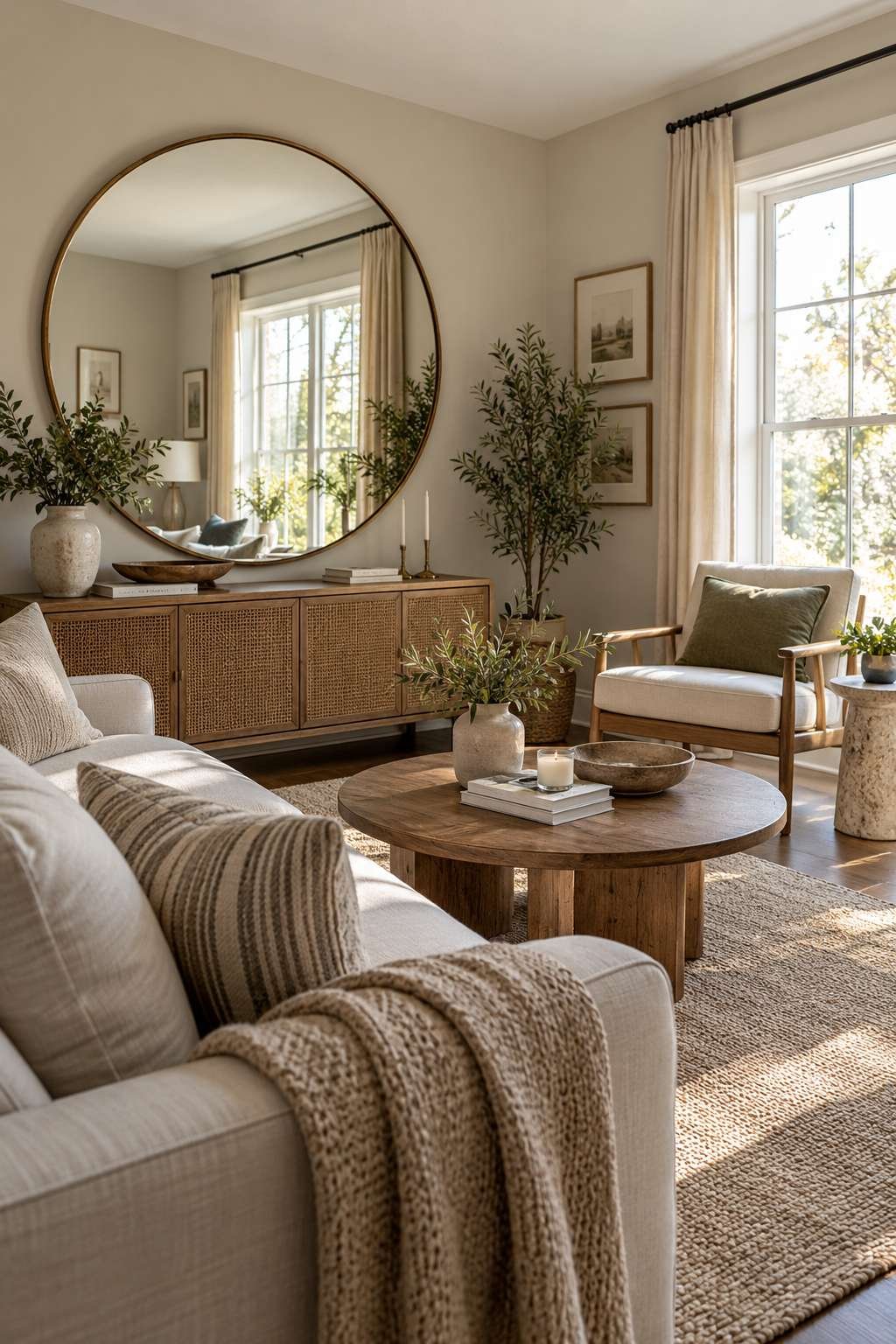
Position a mirror to reflect a window or light source directly, and the room will read noticeably brighter and more open than the same space without one.
- Add at least one large mirror positioned to reflect natural light
- Use glossy or satin trim to bounce light along architectural lines
- Choose light-colored or reflective flooring where possible
- Keep window treatments minimal to let in maximum natural light
- Avoid heavy, light-blocking curtains in already-small rooms
8. Coordinate Paint with the Room’s Function
Beyond visual size, paint choice also shapes how a room feels to occupy day to day. If you’re working on a bedroom specifically, it’s worth thinking about temperature perception alongside spaciousness — our guide on How to Make a Room Colder covers color and material choices that support that goal without touching the thermostat.
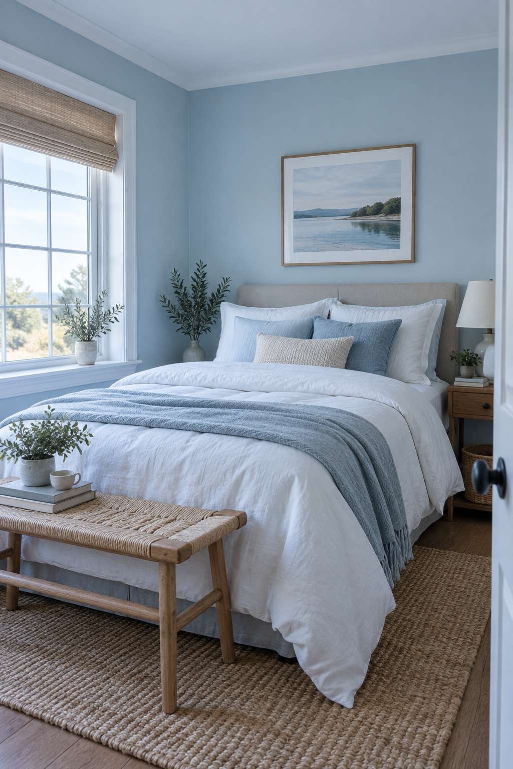
Similarly, if comfort during warmer months is a priority, How to Make a Room Cooler dives into complementary strategies like reflective window film and airflow that pair naturally with a light, cool-toned paint scheme.
- Match your paint strategy to the room’s primary use
- Consider how color temperature affects perceived room temperature
- Combine paint choices with airflow and lighting adjustments
- Think about the room at different times of day, not just when painting
- Revisit the plan seasonally if the room’s use changes
9. Don’t Overlook Scent and Air Quality
A room can look bigger and brighter with the right paint job, but a stuffy or musty smell undercuts the effect immediately — cramped-smelling rooms feel small no matter what color is on the walls. If you’ve noticed an odd smell during a repaint, it’s worth checking our guide on Why Does My Room Smell Musty before finishing the project, since trapped moisture behind old paint is a common culprit.
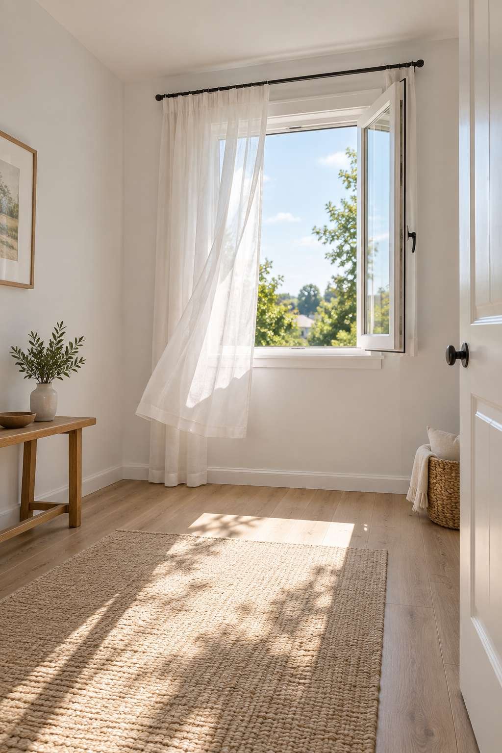
Once the room is freshly painted and ventilated, our piece on How to Make Room Smell Good offers simple ways to keep that fresh, open feeling going long after the paint has cured.
- Ventilate thoroughly during and after painting
- Address any musty smells before repainting over the problem
- Use low-VOC paint for better air quality during the project
- Keep the room well-ventilated for the first few days after painting
- Layer in light, fresh scents once the paint has fully cured
10. Bring It All Together
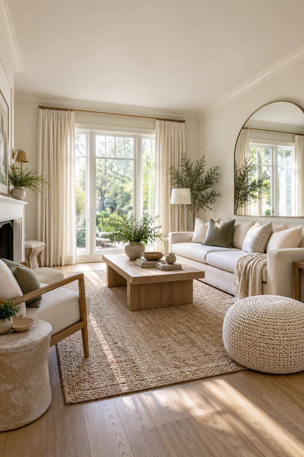
Paint is the fastest lever to pull, but it works best as part of a broader approach to making a small space feel larger. If you want the full picture beyond color alone — furniture placement, lighting layout, and decluttering strategies — our comprehensive guide on How to Make a Room Look Bigger rounds out everything paint alone can’t fix.
- Start with a light, cool base color across walls and ceiling
- Layer in sheen, vertical lines, and blurred architectural boundaries
- Add reflective accents to amplify the paint’s effect
- Address scent and ventilation so the room feels as fresh as it looks
- Treat paint as one part of a larger small-space strategy
Frequently Asked Questions
What color paint makes a room look the biggest?
Soft, cool whites and pale neutrals tend to work best, since they reflect the most light and create the fewest visual breaks. Warm, saturated colors generally have the opposite effect.
Should I paint a small room a dark color instead?
Dark colors can work in specific cases, like creating a cozy, intentional feel in a room with excellent natural light, but they generally make an already small space feel more enclosed.
Does paint sheen really affect how big a room looks?
Yes. Eggshell or satin finishes reflect light more evenly than flat matte paint, which subtly supports the illusion of a more open, larger space.
Is painting the ceiling the same color as the walls a good idea?
In most small or low-ceilinged rooms, yes. It removes the visual break between wall and ceiling, making the whole room read as one continuous volume.
Conclusion
Making a small room feel larger doesn’t require a renovation budget — it starts with a few smart decisions at the paint counter. Light, cool colors, a matching ceiling, the right sheen, and a few reflective accents can transform how a cramped space feels almost overnight.
Pick one or two techniques from this guide to start, and you’ll likely notice the difference before the second coat even finishes drying.